
The front cover is a reader’s first impression of your book.
“Is this a book I might want to read?”
If a reader is hooked by your book title, intrigued by the subtitle, and impressed by the front cover design, then the back cover of your non-fiction book has 3 jobs at once:
- The description tells the reader what they’ll get out of reading the book.
- The short bio tells them why you’re the right person to write that book.
- The overall design of the cover (and the quality of the copywriting) tells them if the book is professional and valuable.
Basically, the cover gets them interested; then the back cover helps the reader decide whether or not they want to go any further.
Because it has 3 jobs—visual, informative, and persuasive—the back of your book is really a combination of marketing copy and design.
This post will walk you through both aspects of the back cover, as well as how to choose the right designer for your book and how to write back cover copy that will grab a buyer’s attention.
How to Design Your Back Cover
One of the first things to understand about book cover design is that the back cover of a book is an integral part of the whole. You can’t design the back without designing the entire thing.
When books are printed, the cover is created as one whole image on a special sheet of thick paper called cover stock. The image includes the front, spine, and back. Then that cover is cut to the right size and folded to form the book’s binding.
So you never want to design the back of the book by itself. The whole cover of your book needs to be sent to the printer as a single pdf file, and it should be created that way.
Your book’s printer will also have specific requirements for the back book cover or book jacket, like where the ISBN barcode goes, and the correct color profile and settings for your pdf file.
And, if you’re including an Author photo, it needs to look just as professional as your book and work well with the rest of the design.
But even beyond the technical aspects of a good book cover, there’s an art to laying out the text of the back cover copy. It isn’t anything like just typing up a letter and printing it.
Designing a back cover that will hold a reader’s attention is a combination of artistic design principles and a print specialty known as typography.
Typography: words as design
Typography is the art of arranging type to be easy and appealing to read, especially when it’s printed. Modern book designers have to know how to do that for both digital and print formats.
Since book covers today are created on computers, digital book covers have the advantage of looking the same way on Amazon as they do on the designer’s screen.
But print is a whole different story.
Digital images are made of light—light literally forms the picture, which is why your computer screen is dark when it isn’t on. There’s no light to make any images.
Print images are made by ink that’s printed onto a physical page. That’s why printed images aren’t as bright as digital ones—they’re only reflecting light, not made of it.
So the type on your back cover has to be easy to read either way, and the colors have to look good in both media. If you hold a printed book up to an image of the same book on Amazon, you’ll see that the colors aren’t exactly the same.
Printing gets even more complicated because printed ink bleeds, if only a little. So, type that looks great on a computer screen can be too thick or too thin in print, depending on what other colors are next to it.
Here’s the deal: the typography of book design isn’t just art. It’s also technological know-how and a lot of math.
Typographers choose a professional font and manipulate it by making it thicker or thinner, spacing the letters closer together or farther apart, and even hand-tooling the individual letters to make your back cover copy look clean and professional.
If you don’t know how to do those things, or even if you have experience doing it digitally but not in print, that lack of experience is going to be obvious to the reader.

They won’t know what’s wrong with it exactly, but their overall impression will be: “Hey, there’s something cheap looking about this.”
If you want your book to look professional, you should hire a professional.
Other back cover design elements
Hopefully, I’ve already convinced you to hire a professional to design your book. But when you do, you’ll need to know a couple more things about back cover design to make the right choice for your book.
A great book design will make your book feel like one coherent, professionally designed package. The look and feel of the front will continue across the spine and onto the back, often by subtly echoing the book’s core colors and design elements across the 3 faces of the book.
So you really need a cover designer who isn’t just a typographical specialist within the self-publishing context, but also one with a great eye for overall layout and composition.
It’s best to look for one person who can design the front, spine, and back cover together—and I’d personally be wary of a cover designer who doesn’t provide the complete pdf you need.
The only exception would be if you want custom artwork for the cover. In that case, you’re really hiring 2 different artists:
- The illustrator, who creates the original art for the cover
- The typographer/designer, who lays out the cover as a whole, placing the art into the overall design along with the title, subtitle, author name, and any other design elements
Ideally, your cover designer should specialize in your book’s genre.
If you’re publishing a business book, look for a portfolio of bold, modern titles with color that really pops, and imagery that’s minimal but full of energy.
If you’re publishing a memoir, look for a portfolio with elegant, meaningful type, as well as expert use of photo manipulation to set an emotional tone.
And, most of all, follow your gut! Always. Because your prospective readers will too.
Last but not least, your cover designer will need you to provide them with the back cover copy.
How to Write Back Cover Copy That Sells
The back cover copy of your book consists of 2 parts (sometimes 3):
- Your book’s description (about 150 words)
- Information about you, the Author (about 100 words)
- One or two great testimonials (sometimes called a book blurb or cover blurb), if you have any (optional)
Writing your back cover description
The first thing to remember about your book description is that it’s a design element of your book, so it has to fit naturally and easily on the back cover.
If it’s too short, it won’t give readers enough information to make them open the book and start reading.
If it’s too long, it won’t fit well on your book. No designer, no matter how professional, can make a 500-word description look good on the back of a standard trade paperback.
So, what’s the best length to shoot for?
A 150-word description strikes a great balance.
It gives you enough room to sell the reader on the book while giving your cover designer enough space to lay it out comfortably.
But here’s the most important thing to remember in writing your nonfiction book description:
It should not explain your book. Instead, it should create interest and connection with the reader.
Think about your target audience, and ask what those people need to know about your book to help them understand how much they’ll get out of reading it.
Writing a great book description isn’t about making everyone want your book—that’s impossible, and trying to do that is counterproductive. You’ll end up with mediocre cover copy that doesn’t appeal strongly to anyone.
Instead, try to make your specific target audience want your book. Believe it or not, by targeting your back cover copy at a narrow audience, you’ll end up making your book sound a lot more interesting to a lot more people.
For more help doing that, read my full post on writing a great book description.
Writing your back cover Author bio
The back cover Author bio usually comes after your description and should be around 100 words (fewer is fine, but I wouldn’t go below 60 or 70).
If the description is about selling the book, the bio is about showing the reader why you’re the right person to write that book.
A lot of Authors have trouble writing the bio, so read my full post on Author bios if you’d like more guidance on how to do that.
The most important thing to remember about all your back cover copy is that readers need to know why they should read the book.
If you’ve solved a problem they’re currently facing—or if you have special information that most people don’t have, making you the perfect person to write this particular book—you should share that with your readers.
Examples of Great Book Back Covers
1. You End Up Where You’re Heading: The Hidden Dangers of Living a Safe Life, by Jimmy Rex and Cameron Carling

The image of a natural landscape in unnaturally vibrant colors is the perfect companion to the book’s description, inviting readers to step out of their comfort zone in pictures as well as words.
“You settled for the first job that came along, the okay apartment, and the steady but unfulfilling partner. You thought you were playing it safe.”
These authors do a great job of appealing to the people who need this book by describing, in just a few words, what that reader’s life looks like.
A lot of first-time Authors get hung up on the idea that they’ll “turn off” potential readers by targeting their readership too narrowly. But that’s just not how people work.
If you don’t like your job but you have an amazing spouse, you won’t think, “This book doesn’t describe me.” Instead, you’ll focus on the problem you do have: “Maybe this book can help me find a job I’ll like more.”
Don’t worry about targeting your readers too narrowly. People will resonate with the parts that fit them. If they’re interested in the book for any part of their life, they’ll check it out.
2. Boot Straps & Bra Straps: The Formula to Go from Rock Bottom Back into Action in Any Situation, by Sheila Mac
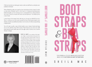
This cover is an attention grabber. There’s no doubt about it.
Notice that the title is catchy but doesn’t tell you anything about the book on its own. It’s the subtitle that makes you want to keep reading.
If you’d like some guidelines about how to create this kind of rockstar title/subtitle pair, read my posts on crafting great titles and subtitles.
Everything about the cover design, from the typography to the colors and layout, says “positive, feminine fun.”
The description copy sets the exact same tone, with a first-line that speaks directly to the readers this book was written for:
“If life has knocked you down, get ready to pick yourself back up and give your problems the boot!”
3. Income Bliss: Create a Retirement Income That You Can’t Outlive, by Bob Gardner, CLU, ChFC, RFC

Between the title, subtitle, and cover art, this cover design sets up the description perfectly.
The idea of creating a retirement income that you can’t outlive addresses a pain point for a lot of people, and the description backs up this theme with more detail: it doesn’t have to be frightening; anyone can do it.
But the closer is the Author bio, which in this case is nested in the middle of the book description.
“Financial advisor and wealth management expert Bob Gardner has spent his career helping his clients build successful portfolios that have the stability to last through their retirement, and that give them the liquidity to enjoy it.”
It’s easy to promise that you can help people make money, but this Author has the credentials and experience to back it up.

Tucker Max
Tucker has sold over 5 million books as a 4x NYT Bestselling Author and is the co-founder of Scribe. More Book PublishingReady to Write Your Book?
Scribe has helped 2,000+ authors turn their ideas into published books. Schedule a free consult to get started.
Schedule a Consult