
I’ll be honest: manuscript formatting is tedious and boring.
It’s also important to get it right. If you don’t, your book will suffer, and you’re going to spend more money than you need to on editing.
Why?
It comes down to readability for the editor. If you send in a manuscript that’s not formatted properly, your editor will do three things:
- Think you’re unprofessional and edit your book under that assumption.
- Not fix your formatting, and do a poor job editing as a result, or
- Charge you more a lot more money to do formatting work you should have done.
The good news is that it’s easy to set up the standard format for a manuscript, and once you get it right, you don’t have to re-learn it. You can use the same book template, over and over.
In this guide I’ll teach you:
- Industry-standard formatting practices to make sure your manuscript is professional.
- Step-by-step instructions in Microsoft Word or Google Docs.
- An example of a correctly formatted Manuscript.
What Exactly is Manuscript Format?
A manuscript is the finished, written book. The actual Microsoft Word or Google Docs file that is your book.
Formatting is how your manuscript looks and reads. Things like font size, page color, word count, page number, line spacing, paragraph breaks–everything that goes into the visual appearance.
This means manuscript format is the proper way your manuscript should look when you send it in for editing.
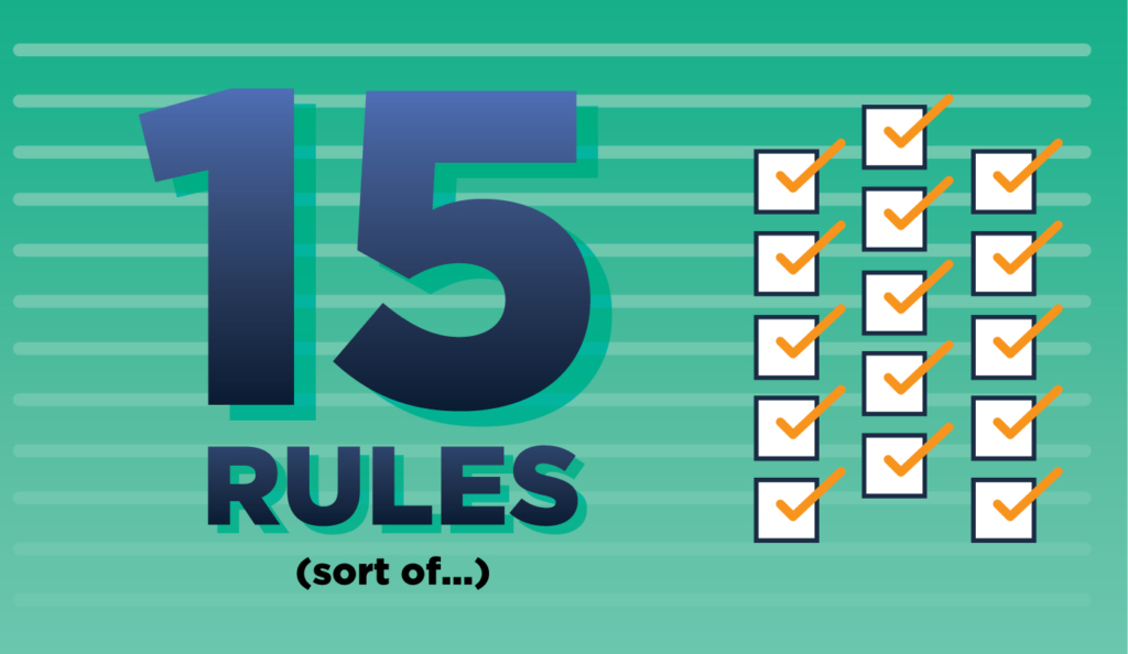
The 15 Scribe Manuscript Format Rules
Before we start, understand there are no actual “rules” for formatting. You can’t go to the Formatting Police and get official law on Standard Manuscript Format (I wish, that would make things much easier).
There are no rules, only conventions that developed over the past century of book publishing. What I’m about to show you are the 15 formatting rules that our book editors ask from our authors at Scribe.
These rules also reflect the ones most common conventions in the publishing industry.
Most of them will seem obvious to you, and most are baked into the defaults of Microsoft Word or Google Docs. If you don’t touch the defaults on your word processing program, then most of these will be non-issues.
The thing is: every one of these are routinely violated by authors who don’t pay attention, and that is why we mention them.
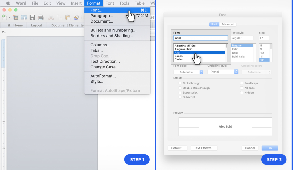
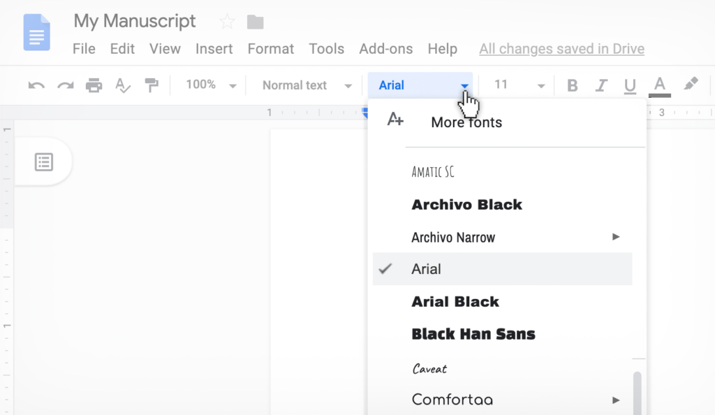
1. Use A Standard Font (Times New Roman or Arial)
The most common print font is the serif font Times New Roman. The most common web font is the non-serif font Arial. They both work great. Don’t use anything else for your manuscript.
Note: your actual book may end up with a different font. There are some fonts that read better in book format. Leave that decision to the interior layout stage, not editing stage.
To check that you have the correct font, in Word do this:
To check that you have the correct font, in GDocs do this:
2. Black Text on White Background
It’s possible to change the defaults on your word processor to something other than black text on a white background. If you want to do that while you write, cool–just switch it back to the regular defaults for submission.
This mainly happens when people use different color text. Just don’t change the defaults, and you’re fine.
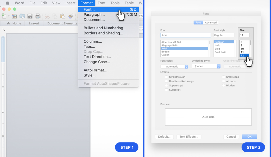
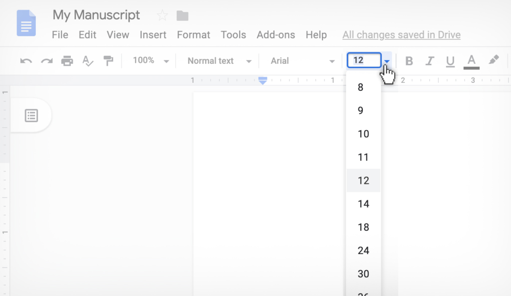
3. 12 Point Type
The type size is how big the letters are. 12 point is usually the default in a word processor because it’s easy to read for most people.
To check that you have proper font size, in Word do this:
To check that you have proper font size, in GDocs do this:
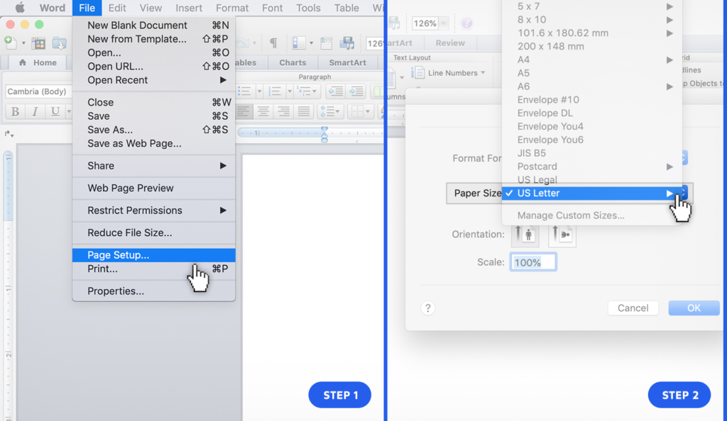
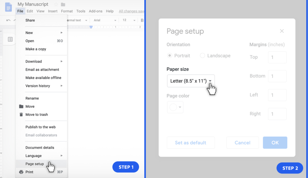
4. 8.5 x 11 Page Size
Again, this is a default page size on most word processors, so don’t change it and you are fine.
To check that you have proper page size, in Word do this:
To check that you have proper page size, in GDocs do this:
5. One Inch Margins
One inch margins on the border of the document is the standard format. This means the right margins are one inch, the left margins are one inch, etc.
This used to be a very important formatting convention when manuscripts were submitted as printed documents. That doesn’t happen much anymore, so this is not important. If you keep the word processor defaults, you’ll be fine.
6. Left Justified Alignment
Left justified means that left hand text is aligned, while the end of the right hand text is jagged. It looks like this:
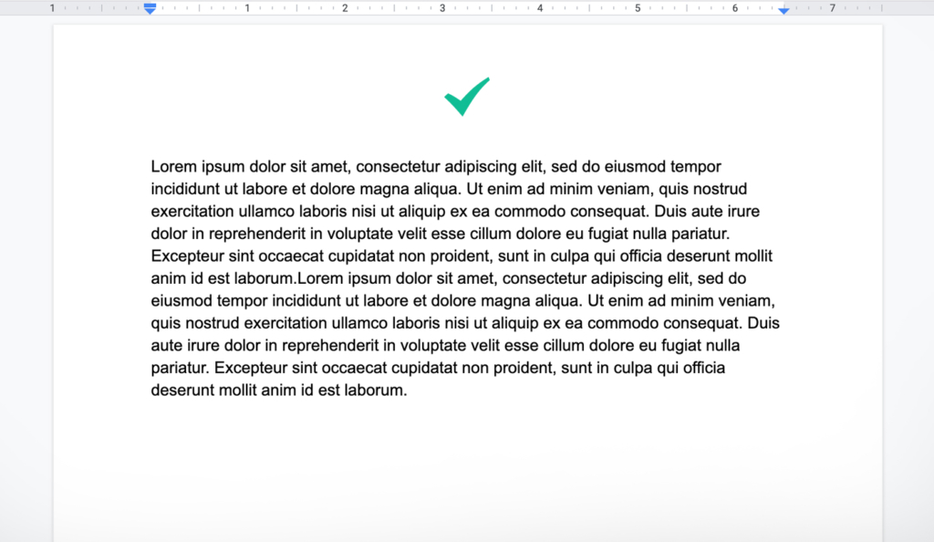
Again, that is the default on most word processors.
The thing to avoid is Fully Justified, where each line looks the same length, like this:
Your final book may be formatted that way, but do not format your manuscript like that.
7. One Space After Periods
You should have a single space after a period, not two spaces.
If you’re under 40 and confused why I would even mention this, it’s because you learned how to type on computers. Many of us olds learned typing on manual typewriters, and the convention for those was to hit the space bar twice and add the extra space to have two spaces after a period.
I know, old people, right?
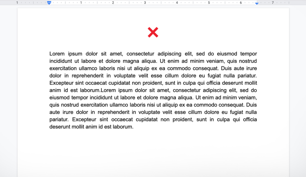
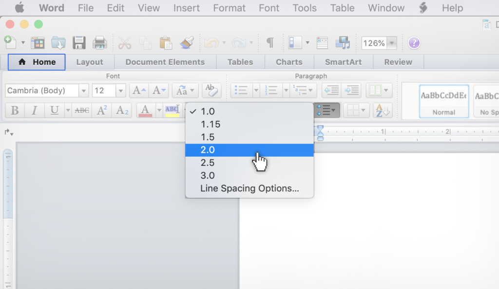
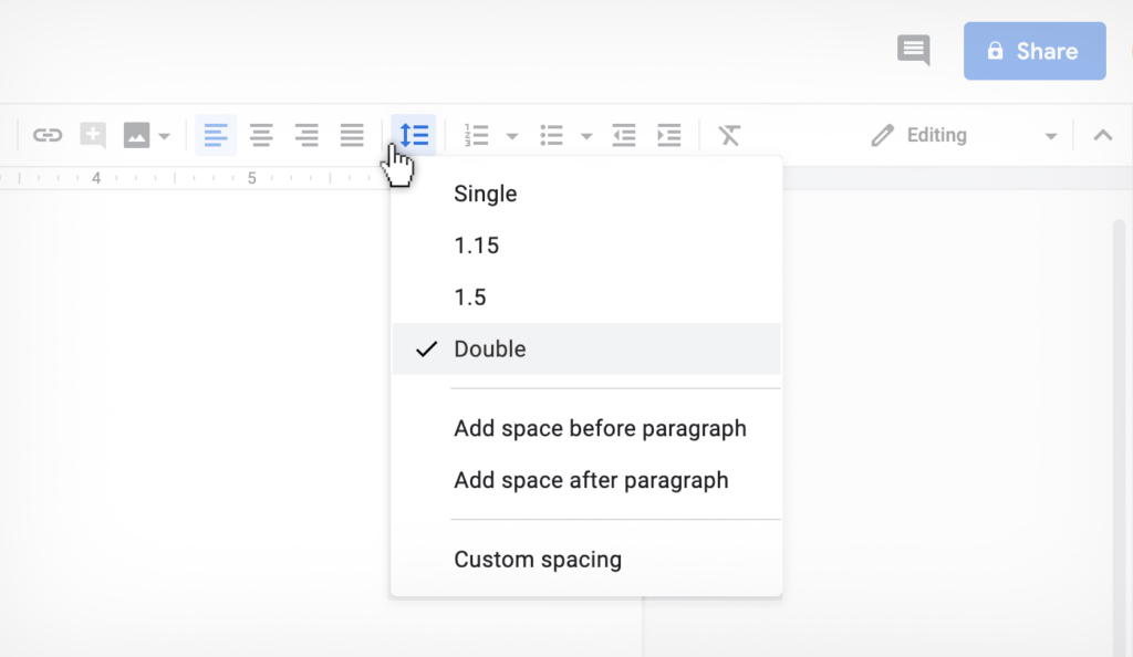
8. Double-spaced Text Lines
Most editors, regardless of the type of editor they are, prefer to edit manuscripts that are double-spaced. Double-spacing means there is an extra line between each line of text. It looks like this:
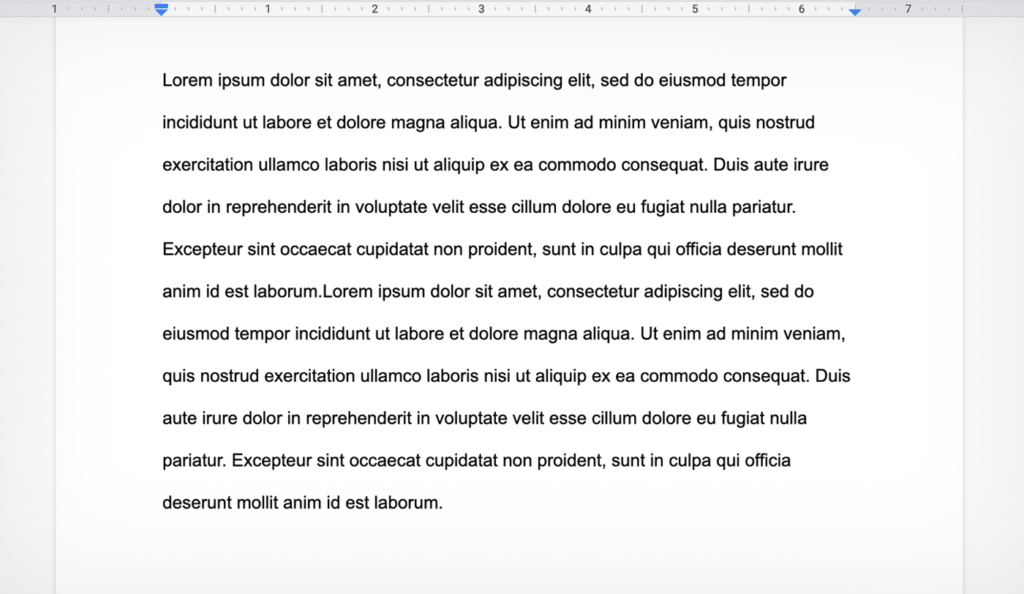
This was an editing style that developed when editing was done on paper, but has persisted because this type of line spacing with extra line breaks and blank lines make reading easier on the editor.
To double space in Word do this:
To double space in GDocs do this:
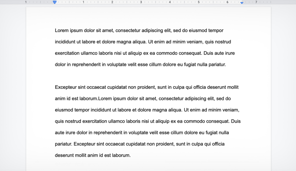
9. Paragraph Classic Style: indented with no line space
There are two ways to format paragraphs, you can choose the one you like. Just don’t mix and match in the same manuscript.
Classic style is paragraphs with an indent at the beginning, and no space between new paragraphs. It tends to be used in novel manuscripts and short stories.
It looks like this:
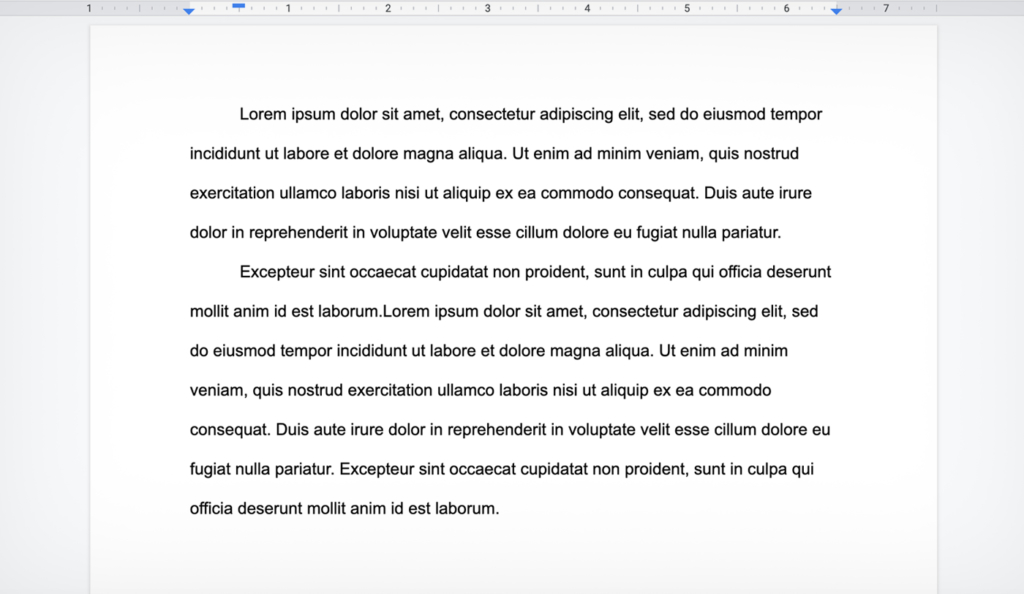
10. Paragraph Modern Style: no indents with line space
Modern style is no indents at the beginning of paragraphs, and a space between paragraphs. It tends to be used in non-fiction. It looks like this:
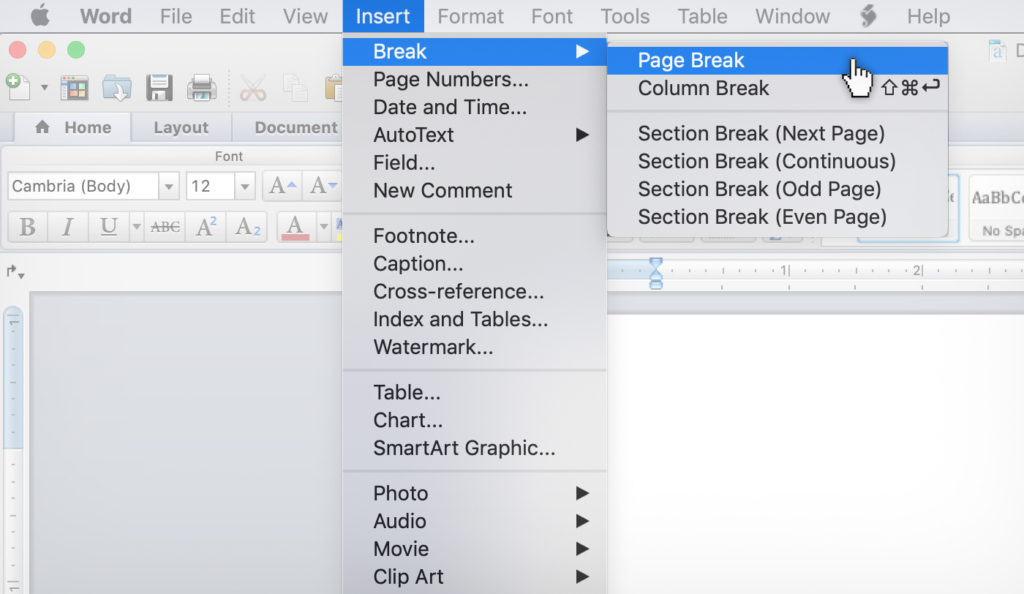
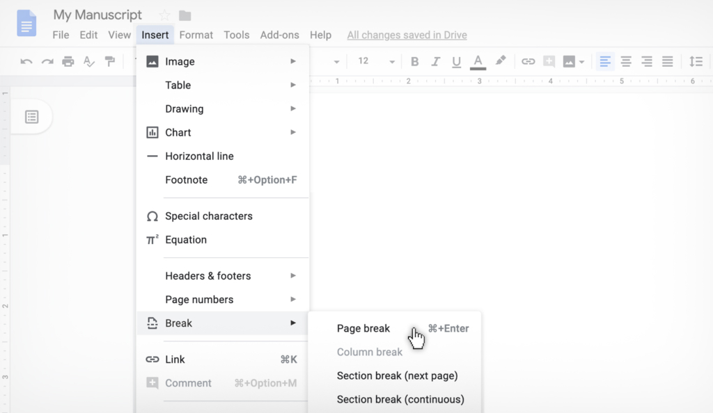
11. Page Breaks Between Chapters
When you finish one chapter and start a new chapter, don’t just hit the return key until you get to a new page. Instead, use the “page break” function. What that does is insert a new page, without inserting a bunch of hard returns and space into the manuscript.
To insert a page break in Word do this:
To insert a page break in GDocs do this:
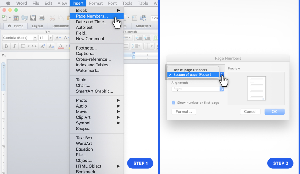
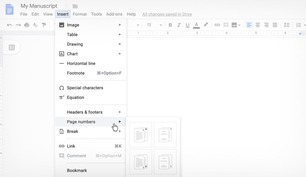
12. Number Your Pages
Editors love to see page numbers. This is for many reasons, most of which I don’t think apply in a modern world with a search function, but they still insist on them, so it’s easier to just add page numbers.
To number your pages in Word do this:
To number your pages in GDocs do this:
13. Send Your Entire Manuscript as One Document
You’re welcome to write in as many documents as you need. That’s common practice to put each chapter in its own document.
As long as, before you submit for editing, combine them all into one document. There is no quicker way to enrage your editor than send them a folder with 15 chapters all in different documents.
14. Use Style Function To Format Headings
When you want to make a chapter title or chapter number or any sort of heading stand out, the best way to do it is to make it a larger or bolder font, right?
Yes, but there is a right and wrong way to do that.
The wrong way is to manually do it. This means changing the font size, or underlining it, or italicize it, by itself. Doing this can get it to “look” right, but you are risking being inconsistent, and making the later formatting very hard on the interior designer.
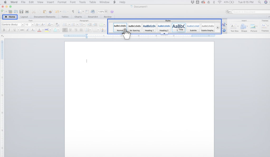
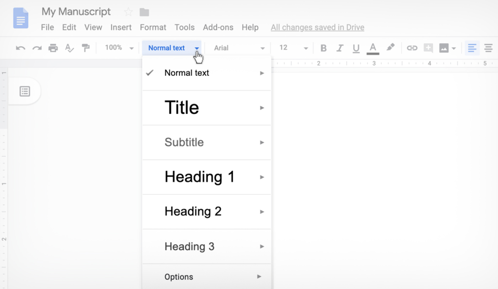
The correct way is to use what is called the “style function.” What this does is associate the correct heading (H1, H2, H3, etc), which makes everything consistent and easier for the interior designer. But really, it makes sure your book look the way you want.
To use the style function in Word do this:
To use the style function in GDocs do this:
15. Proper Title Page Layout
There are many acceptable ways to layout a Title Page. Generally speaking the Title Page is the first page of the manuscript, and needs to include the book title, the sub-title, the word count, your contact information (including email and phone number). You can also have a physical address as well. This should all be on the first page.
Here is an example of the format we recommend:
The Scribe Method (book title)
The Best Way To Write and Publish Your Non-fiction Book (sub-title)
by
Tucker Max815-A Brazos St
Austin, TX 10001
(512) 555-1212
[email protected]2,000 words
Note: In this post, I did not include any of the conventions on submitting query letters to a literary agent, or manuscript submissions to publishers, or all the various other forms of submission guidelines that publishing houses can heap on writers. Though things like submission guidelines to literary agents and publishers are important, they’re a different issue than manuscript submission guidelines for editors.]

Tucker Max
Tucker has sold over 5 million books as a 4x NYT Bestselling Author and is the co-founder of Scribe.Read This Next
Scribe Doesn’t Use Sensitivity Readers. Here’s Why.
What Should Authors Listen for when Reviewing their Audiobook?
More Book EditingReady to Write Your Book?
Scribe has helped 2,000+ authors turn their ideas into published books. Schedule a free consult to get started.
Schedule a Consult